Liquality
ROLE: Senior UI/UX, Visual Design
Incubated at ConsenSys, Liquality is a web3 start-up widely known for being the first open source, multi-chain, self-custodial wallet extension. In parallel to the wallet, a robust SDK is being built to helped bridge web2 companies to web3.

Case Study:Wallet Redesign
At the start of joining the team, the mobile wallet was in the midst of being built based on the current design and functionality of the desktop wallet extension. My task was to optimize the mobile app experience (ios) and visual design that would later, influence updates to the extension.
Team
The product team consisted of the company Co-Founder, a UX Architect, UI/UX Designer (myself), Product Engineering Lead and a dev team of 10.
My Contribution
• Conducted a product audit and analysis
• Conducted a competitive audit
• Collaborated with the UX Architect for product requirements gathering.
• Led UI/UX, visual design and interaction design
• Created and maintained a pattern library
• Worked with dev handoff & QA
• Facilitated live design/dev workshops
Challenge
After auditing select flows of the mobile wallet, the following challenges became the groundwork for optimization:
• Transaction flows for buying, swapping, and sending crypto needed to be streamlined and made more lightweight.
• The filter feature for transactions was overloaded with options and required UX and visual design rethinking.
• The NFT account and transaction flows lacked ease of use.
• The team and stakeholders desired a more current and less dated look and feel.
• Typography, layout, and UI required redefinition.
• A design system and pattern library needed to be built and maintained.

Previous Design
These landing pages are the original design for the desktop wallet extension. They served as the basis for exploring new design directions.

Updated Design V1
Mobile wallet- landing page in light and dark mode. Colors, fonts, iconography, layout and interactions were explored in all versions.

Updated Design V2

Selected Design
The final design direction was selected by the team for its techy-modern feel, incorporating sharp lines and angular shapes. Familiar UI patters, such as large transaction buttons and the ios app bar and were also preferred. This choice served as a springboard for the wallet's redesign. The rethinking of UI patterns and interactions followed.


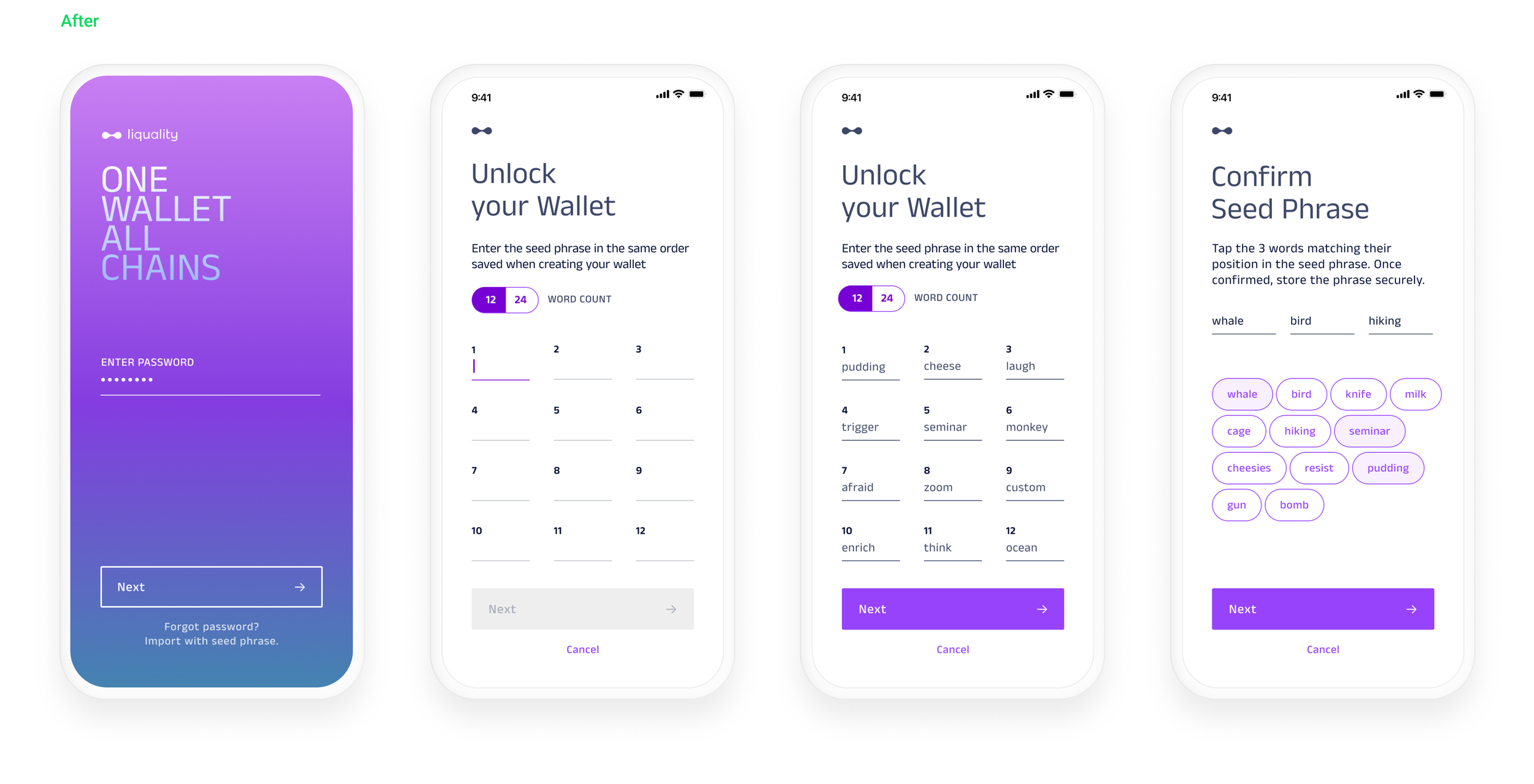
Visual design clean-up continued with the onboarding screens. The gradient that appeared on every page was now limited to the welcome and login screens, which created more space for UI. The persistent oversized logo has been scaled down to its mark in the title bar, and improvements to typography were made.


A modal wasn’t the correct UI to hold dense content like Swap Providers and it wasn’t scalable. The updated design placed the content in its own page.
• I changed the interaction so that the content is organized under a tabbed nav.
• All providers are shown up front, while the content for each are contained in a carousel.
• On scroll up, the header minimizes in the title bar allowing the user to horizontally scroll through all providers.


The updated filter design replaced the main header and organized content by chain. A drawer was used to hold advanced filter features while UI, typography and color meaning was more clearly defined.


NFTs and their collections from multiple chains can be managed within the wallet, including the ability to send and receive them. When sending an NFT, the wallet initiates a blockchain transaction, specifying the recipient's wallet address and the unique identifier of the transferred NFT. Similarly, when receiving an NFT, the wallet monitors incoming transactions addressed to the user's wallet on the blockchain. The following screens showcase a selection of this feature, reflecting the updated design.


